
'How to Win a Grammy Award' - Information Visualization
Human Centered Design & Engineering, Undergraduate Program
Project Goal:
To visualize Grammy award data that uncovers the patterns with winners throughout the past decades.
Example Questions:
- How does the music taste change over time?
- How does winner’s sex/age change over time?
- Is there correlation between the winning songs (Critics Choice) and their popularity on music website, such as Spotify, Last.fm (Public Choice)?
- Among all the winning songs, Is there a pattern in the release date(month)?
- Is there a pattern among winning songs between how close they became popular to the Grammy awards themselves?
Process:
- Research to find inspirational visualizations and data sources
- Sketches and storyboards to demonstrate what information we want to display and how they relate
- Develop early ideas using Tableau
- Test visualization ideas with users
- Update and finalize Tableau design
Inspirational Visualization:

How to Win an Oscar infographic from http://www.dgquarterly.com/oscars-infographic
Data Gathering:
- Title
- Genre
- Artist Name
- Artist Gender
- Artist Age
- Years Active
- Song Popularity (Number of week's on Billboard's top 100 list)
Data Sources:
- Grammy.com
- Billboard.com
- Wikipedia.com
Sketches and Storyboards:

Understanding the relationship between available data pieces

Sketch of possible starting visualization
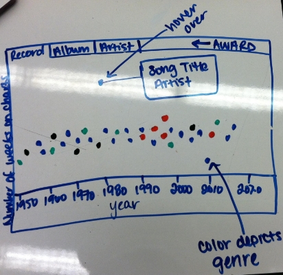
Sketch of possible visualization view

Sketch of possible view for How to Win a Grammy visualization with clickable years
Initial Mockup and Usability Testing:
Include mockup
Usability Testing:
Final Visualization:
To view the final visualization - CLICK HERE